Thursday, 31 March 2011
T-shirt Printed
Just as a way to visualise the idea further, I had a test t-shirt printed. I'm fairly pleased with the outcome as a first attempt, but feel that the image isn't clear enough, or at a standard high enough to print from. Im also not happy with the shiny transfer used for the image. I wanted the image to blend into the t-shirt like it does in the original print. I don't like the size of the text underneath the image, and if I was to print it again, I would probably not use the text at all. Instead I would create a label inside the t-shirt with the website information.
Wednesday, 30 March 2011


Art in Unusual Spaces Lecture
In my opinion, art outside of conventional institutions in something really exciting. It begins to have other elements that become a work of art itself. For example, mentioned earlier in my blog, the Liverpool 2010 Biennial used Rapid, a disused store in the city centre as its base, as well as to hold many works. I became interested in this different approach and radical thinking about how to display artworks such as in the stores windows, a space we are used to seeing retail items. By doing this I feel it engages better with the public, as people who may not be interested in viewing art in its conventional settings, such as galleries and museums, are now forced to either engage or notice art.
Raphaelle de Groot is a Canadian artist, who explores working outside of the institution. For 8x 5x 363 +1 (2002- 2006) de Groot took up residence in a textile factory in Biella, Italy. Rapaelle found that trying to hold and sustain a conversation with the workers in the loud and busy factory was almost impossible. She initially explored the idea of using boxes, in which she would ask the factory workers a question and they were to answer through posting their response through the box. She eventually replaced the system with disposable cameras, again she would write a question on the camera, although this time the workers were to respond by answering the question with a photograph. I really love this idea of the responses being photographic representations as to what the artist had asked, and the idea that each response would be different.
Manifesta, is a multi-faceted organisation that holds Biennials.
Tuesday, 29 March 2011
Presentation Cards
It was discussed in my assessment the importance of the imagery for what were called my business cards. The text was found to dominate the imagery. So, I had to find a way of relaying across the important information, such as my name. I possibly became misguided by looking at business cards, which were considered as commercial. It was felt that because my imagery was in the format of a photographic image, it was not necessary to say that I am a Photographer. I decided that there was no need to write my name over the image, as this is in my web address. I feel that the most important piece of information is the web address, because as of yet, it is still not appearing first when googling my name. The rest of the information such as contact details, and a description of what I do can be found on the website. So a more devised idea of just by capitalising my initials in my name, and by making my name slightly larger than the www. and .com. Here is the latest presentation card layout.


Sunday, 27 March 2011
Plastic Bag
I found this beautiful short on youtube. I love the idea of an inanimate object becoming animated and having its own narrative. The idea of a plastic bag, an everyday item which we are constantly in contact with, whether it be to carry our shopping, to sit on when the ground is wet, or lying wastefully in the environment.
You are taken on a journey of life as a plastic bag. The use of an emotion such as love, encourages you to emphasise with the bag, which of course sounds ridiculous, but I couldn't help but find myself rooting for the bag to find his 'maker'. It reminded me slightly of the works mentioned earlier by Jamie Isenstein who also plays with the inanimate becoming animated.
I just love the simplicity of the subject, and how its manipulated.
Thursday, 24 March 2011
Summative Assessment 2
I felt the assessment went quite well. I seemed to have a different approach to others, in that I hadn't decided to use a powerpoint presentation method. Maybe this is something to look into for further assessments, to display more clarity and to keep as a personal record.
It was the first time in showing the group my book I had published, which seemed to go down quite well. As the book was intended as a 'try out' maybe this is something to explore further. I feel that the size of the book could be reduced to maybe A5 and intend to create another displaying my photographic collections of objects such as chairs, signs and surfaces.
One thing I need to consider is the placement of the book and possible t-shirts in the exhibition. I have thought about using invisible bookshelves and will explore combining this with the pieces I am showing in the exhibition, exploring different layouts in my studio space and peer group responses.
I am currently exploring a range of ways for the business cards to be displayed, whether its simply on the floor, or on a magnetic surface.

One of the options could be to create a mini installation using an old disused fridge, which would fit in with the theme of my work, although getting hold of one and disposing of it afterwards may be a problem.

I found this magnetic chalkboard in ikea. I like the idea of it. I was thinking of creating something similar myself so that it could store the books, although it may prove a problem as it may detract attention away from my work.
The use of a slim magnetic strip might be more appropriate, as it would display the cards neatly, whilst not detracting as much attention.
It was the first time in showing the group my book I had published, which seemed to go down quite well. As the book was intended as a 'try out' maybe this is something to explore further. I feel that the size of the book could be reduced to maybe A5 and intend to create another displaying my photographic collections of objects such as chairs, signs and surfaces.
One thing I need to consider is the placement of the book and possible t-shirts in the exhibition. I have thought about using invisible bookshelves and will explore combining this with the pieces I am showing in the exhibition, exploring different layouts in my studio space and peer group responses.
I am currently exploring a range of ways for the business cards to be displayed, whether its simply on the floor, or on a magnetic surface.
One of the options could be to create a mini installation using an old disused fridge, which would fit in with the theme of my work, although getting hold of one and disposing of it afterwards may be a problem.

I found this magnetic chalkboard in ikea. I like the idea of it. I was thinking of creating something similar myself so that it could store the books, although it may prove a problem as it may detract attention away from my work.
The use of a slim magnetic strip might be more appropriate, as it would display the cards neatly, whilst not detracting as much attention.
Tuesday, 22 March 2011
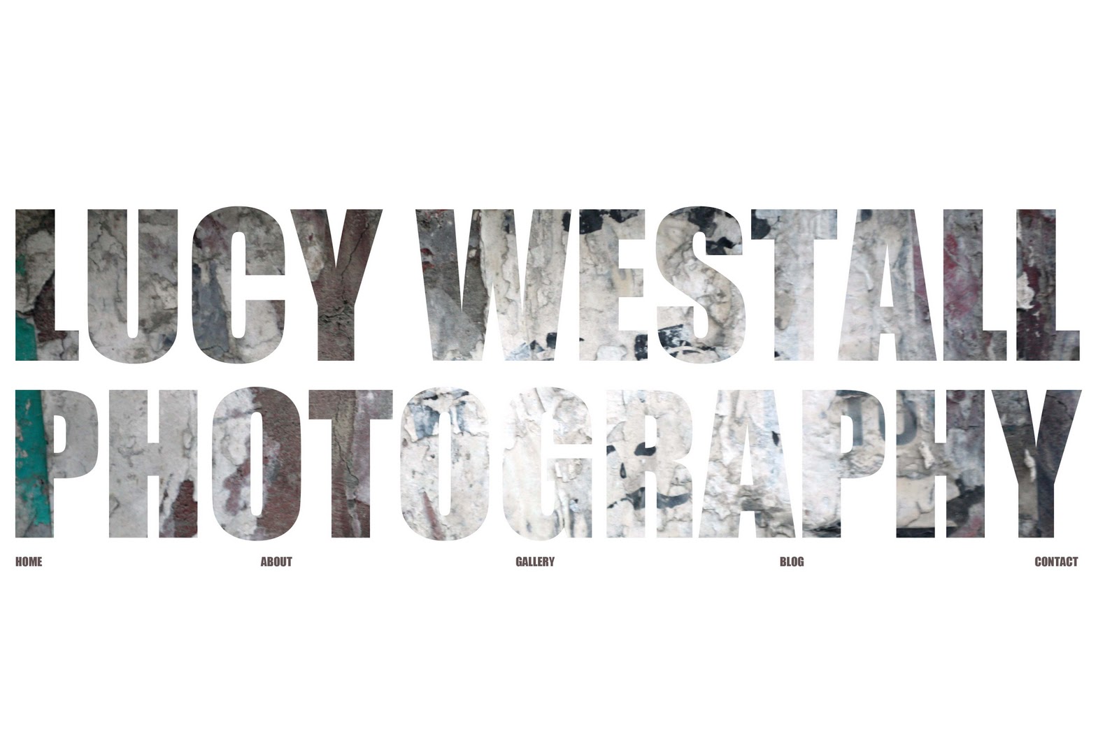
Website template ideas

This is my inital layout that I want for the website. At the moment its almost impossible due to different screen sizes, which then alters the size of the image and shifts everything, including the text. This is something I will explore further and hopefully resolve the problem. Trough researching current fine art/ photography websites I came across this website which is of a similar idea, only the image doesn't fill the whole screen which may be the solution.
http://www.krijtenberg.nl/
T-shirt Printing
A quick outline of an idea for printing t-shirts for the exhibition. I would like to explore the idea of screen printing them myself, but may also have one made professionally to see which outcome works best.


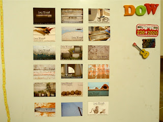
Business Card Magnets Test
I tried to print onto the magnetic photo paper, which is supposedly suitable for ALL inkjet printers, except mine in being fussy. The printer recognises it as a paper jam rather than just thick paper and I cant seem to find 'magnetic photo paper' in the printers presets.
So for the time being, I have decided to print onto glossy paper, and then spray mount it to the magnets. This is intended as a temporary solution until I find a printer that will accept the magnetic paper. Im quite pleased with the out come and here are a few photos of them at home.


Business Card Magnets
I began working in Pages but found the formatting on the images and text boxes really constricting- as well as annoying. I have now moved into a more appropriate program (Photoshop) and it's going much better.
Some test sheets that I wanted to try out first. The second image is the most recent with a few changes to the images which I felt were the weakest.
I didn't anticipate the different aspects of designing the cards and how time consuming it really is. The smallest detail matters. I've decided to fit 18 images per page (A4) which does mean the cards will be small, but is more economically viable.
I m currently exploring the positioning of text, whether its all horizontal, vertical or even diagonal. I was unhappy with my previous attempt and felt that the font, colour and size of text was all wrong. I found that by just taking the hyperlink off of the text how much more professional it looked. I have decided to use 'Hoefler Text' font because I like the 'W' and felt that it stood out. As all my images are different I felt that I should keep the text the same throughout in order to keep some consistency.
I have been researching how professional artists/ photographers have done their business cards and came across this really interesting site:
http://content.photojojo.com/tips/12-awesome-photography-business-card-ideas/
I have been researching how professional artists/ photographers have done their business cards and came across this really interesting site:
http://content.photojojo.com/tips/12-awesome-photography-business-card-ideas/
  |
Wednesday, 9 March 2011
Webshite
In making the business cards I realised that my email address was inappropriate, and felt that using my student email wouldn't be that much better either, so instead of chosing to make a new email account, I bought myself a web domain name and hosting.
In hindsight I didn't quite anticipate how difficult it would actually be to build my own website.
I played around in different website building software such as iWeb and also looked at Wix but felt that I was limited to what I could do and found that the layouts had already been pretty much finished.
I've decided to make a go of it in Adobe Dreamweaver but finiding it incredibly difficult and am constantly referring to tutorials on youtube and other sites. Ive at last managed to get it off of the holding page, but the issue seems to be that I want a image as the background, and due to different screen sizes it affects the size of the image, so its constantly changing. This is something I need to look at and maybe have to look into another way of doing it.
More coming soon on www.lucywestall.com
Business Card Magnets
In preperation for the exhibition I began thinking about ways to try and engage the public, to gain connections and how to publisise myself further. The obvious option was to create business cards which could be distributed during the running of the exhibition. I began thinking about how I could make this card different and appealing and decided to print the card onto magnetic photo paper, in the hope that instead of being discarded or thrown in a drawer somewhere, people may decide to display this card on their fridge or someother magnetic surface.
I now need to decide what image will be printed on the card. I have played around with the idea of using a variety of my photographic work. I hope this will turn the conventionally mundane card into something desirable, even collectable.
Initially I felt that by using one strong image would have more impact, for example just using the 'Through the Window' image due to its repetition in the exhibition, therefore building up an awareness to the public who I am and what my work is. I now feel the use of different imagery would utilise a great opportunity to show more work in a subtle and effective way- I hope.

Subscribe to:
Comments (Atom)